
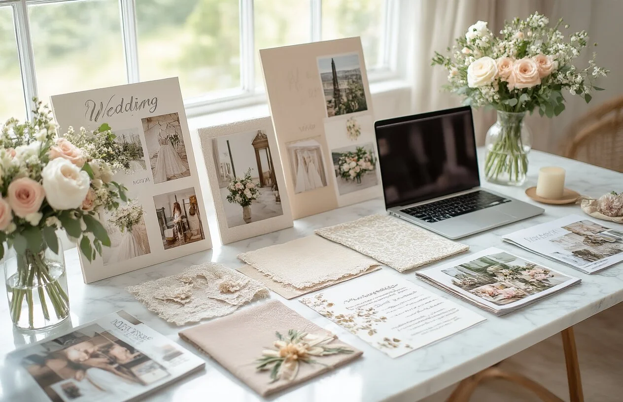
choosing your wedding colors
Your wedding colors set the mood for your entire celebration and tie together every detail from invitations to centerpieces. This guide helps engaged couples navigate the overwhelming world of wedding color palettes to create a cohesive, beautiful day that reflects their personality.
Choosing wedding colors involves more than picking your favorites. You'll discover how color psychology influences your guests' emotions and learn to establish your wedding style before diving into specific hues. We'll also walk you through creating a primary color palette that works across all your wedding elements, from bridesmaid dresses to table linens.
Finally, you'll learn about the most common wedding color mistakes couples make and how to avoid them, ensuring your big day looks polished and intentional rather than chaotic.

Discover how colors influence mood and atmosphere
Colors carry emotional weight that directly impacts how your guests experience your wedding day. Warm colors like deep reds, oranges, and golds create feelings of energy, passion, and celebration - perfect for couples who want their reception to feel lively and spirited. Cool colors such as blues, purples, and greens promote tranquility, elegance, and romance, setting a more serene and intimate mood.
The lighting at your venue plays a crucial role in how colors appear and feel. Natural daylight enhances pastels and makes them appear fresh and airy, while candlelight or warm indoor lighting makes jewel tones look rich and luxurious. Consider whether your ceremony and reception will be in bright sunlight, soft twilight, or dimmed indoor spaces when selecting your palette.
Color temperature also affects the overall atmosphere. Cooler tones tend to make spaces feel larger and more formal, while warmer hues create cozy, intimate settings that encourage conversation and connection among guests.
Learn what different colors symbolize in wedding traditions
Wedding color symbolism varies across cultures, but many meanings have become universally recognized. White represents purity, new beginnings, and unity - which explains its traditional dominance in Western weddings. Red symbolizes love, passion, and good fortune, making it the preferred choice in Chinese weddings and increasingly popular as an accent color elsewhere.
ColorTraditional SymbolismModern Wedding MeaningBlueTrust, loyalty, stabilityPeaceful, sophisticated eleganceGreenGrowth, harmony, fertilityNatural beauty, fresh startsPurpleRoyalty, luxury, wisdomCreative sophisticationPinkLove, femininity, romancePlayful romance, warmthGoldProsperity, success, glamourTimeless luxurySilverModernity, grace, intuitionContemporary elegance
These symbolic meanings can add deeper significance to your color choices, especially if they resonate with your cultural background or personal beliefs.
Consider your personal color preferences and memories
Your instinctive color preferences often reflect your personality and can guide your wedding palette selection. Think about the colors that make you feel confident and happy when you wear them. If you consistently gravitate toward earthy tones in your wardrobe, a palette featuring sage green, terracotta, and cream might feel authentically you.
Examine colors that hold special memories in your relationship. Maybe you shared your first kiss under cherry blossoms, making blush pink meaningful, or perhaps you bonded over sunset beach walks, inspiring coral and golden hues. The flowers from your first date, the color of the dress you wore when you got engaged, or even the hues in your favorite vacation photos can provide inspiration.
Consider colors that make you both feel comfortable and represent your shared aesthetic. Look through your home decor, favorite restaurants, or places you love to visit together for color inspiration that already speaks to your joint preferences.
Evaluate how colors reflect your relationship story
Your wedding colors should tell the story of who you are as a couple. Adventurous pairs who love hiking and outdoor activities might choose forest greens and warm browns that reflect their connection to nature. Art-loving couples could select a bold, creative palette with unexpected combinations that showcase their appreciation for beauty and uniqueness.
Think about the season when you first met, got engaged, or are getting married. Spring couples might choose soft pastels that mirror the renewal and growth in their relationship, while winter pairs could select deep jewel tones that reflect the warmth they bring to each other during colder times.
Consider how your personalities complement each other and choose colors that represent both of your traits. If one partner is more vibrant and outgoing while the other is calm and steady, a palette combining energetic coral with soothing navy blue could perfectly represent your balance.
The location where your love story began or your venue's natural setting can also influence meaningful color choices that honor your journey together.
Establish Your Wedding Style and Theme First
Define your overall wedding aesthetic vision
Your wedding aesthetic sets the foundation for every color decision you'll make. Start by creating a clear vision of how you want your wedding to feel and look. Are you drawn to romantic garden parties with soft, flowing elements? Or do you prefer sleek, modern celebrations with clean lines and bold contrasts?
Collect inspiration from magazines, Pinterest boards, and real weddings that make you stop and stare. Pay attention to what specifically catches your eye – is it the moody, dramatic lighting? The whimsical floral arrangements? The elegant table settings? These visual cues will help you identify your natural style preferences.
Consider creating a mood board that captures the emotions and atmosphere you want to create. Include textures, patterns, and imagery that speak to you, even if they're not wedding-related. A cozy cabin photo might inspire a warm, rustic color palette, while a piece of abstract art could spark ideas for unexpected color combinations.
Your aesthetic vision should reflect both partners' personalities and shared interests. Think about your home decor, favorite vacation spots, or hobbies you enjoy together. These personal elements often translate beautifully into wedding design and help create an authentic celebration that feels uniquely yours.
Choose between formal, casual, or themed celebrations
The formality level of your wedding dramatically impacts which colors will work best. Black-tie affairs typically call for sophisticated color palettes – think deep burgundy and gold, navy and silver, or classic black and white with metallic accents. These colors photograph beautifully in formal settings and complement elegant attire.
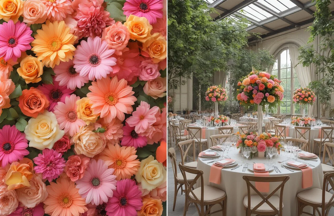
Casual celebrations offer more flexibility and room for playful color choices. Beach weddings might embrace coral and turquoise, while backyard gatherings could feature bright yellows and greens that feel fresh and relaxed. Casual doesn't mean less thoughtful – it means you can experiment with colors that might feel too bold for formal venues.
Themed weddings require color choices that support your concept without overwhelming it. A vintage 1920s theme might use dusty rose, gold, and cream, while a bohemian celebration could incorporate rich jewel tones like emerald, sapphire, and amethyst. The key is choosing colors that enhance your theme rather than compete with it.
Consider your guest experience too. Formal events often benefit from colors that photograph well in low lighting, while outdoor casual celebrations need colors that look vibrant in natural sunlight. Your formality choice also influences whether you'll use one cohesive palette or mix several complementary color families.
Consider your venue's existing color palette and architecture
Your venue is like a canvas that already has some paint on it – work with what's there instead of fighting against it. Historic mansions with rich wood paneling pair beautifully with deep, warm colors like burgundy, forest green, or chocolate brown. These colors complement the existing architecture and create a cohesive, elegant atmosphere.
Modern venues with white or neutral walls give you more freedom to introduce bold colors, but they also require more intentional choices to avoid looking sterile. Industrial spaces with exposed brick or metal elements work well with either warm, earthy tones that soften the space or dramatic, saturated colors that embrace the urban aesthetic.
Outdoor venues present unique challenges and opportunities. Garden settings with lush greenery provide a natural backdrop that works well with soft pastels or rich jewel tones. Beach locations might clash with certain colors – bright oranges and reds can compete with sunset views, while blues and greens create harmony with the ocean.
Take photos of your venue at different times of day and in various lighting conditions. Colors that look perfect in afternoon sunlight might appear completely different under evening string lights or during golden hour. Ask your venue coordinator about their most successful color combinations and any colors they recommend avoiding based on their space and lighting setup.

Pick 2-3 main colors that complement each other
Your primary palette should consist of two to three colors that work harmoniously together. Start with one dominant color that speaks to you – this will be your main wedding color that appears throughout your ceremony and reception. Then select one or two supporting colors that enhance rather than compete with your primary choice.
The classic approach uses complementary colors from opposite sides of the color wheel, like navy and coral or sage green and blush pink. Analogous colors, which sit next to each other on the color wheel, create a more subtle and cohesive look – think dusty blue, lavender, and soft purple. For a timeless feel, pair a bold color with neutrals like cream, champagne, or soft gray.
Remember that your colors will appear in various intensities throughout your wedding. Your bridesmaids' dresses might feature the deepest shade, while your linens showcase a softer version, and your florals incorporate the lightest tint. This creates depth and visual interest without overwhelming your guests.
Test color combinations in different lighting conditions
Wedding venues offer dramatically different lighting scenarios, and your carefully chosen colors can look completely different under various conditions. What appears vibrant in natural daylight might seem dull under dim reception lighting, while colors that look elegant in candlelight could appear washed out in bright outdoor settings.
Visit your venue at different times of day to see how your color palette performs. Bring fabric swatches, floral samples, or paint chips to hold up against the walls, floors, and existing décor. Indoor venues with warm tungsten lighting tend to make colors appear more yellow or orange, while fluorescent lights can cast a cool, blue undertone that affects how your palette reads.
If your ceremony takes place outdoors during golden hour, your colors will have a warm, romantic glow. However, if your reception moves indoors under cooler lighting, those same colors might look completely different. Consider how uplighting or colored lighting will interact with your chosen palette, and ask your venue coordinator about their standard lighting setup.
Ensure colors photograph well for lasting memories
Your wedding photos will preserve these color choices forever, so consider how your palette translates through a camera lens. Some colors that look stunning in person can appear muddy or fade into the background in photographs. Pastels, while beautiful in real life, sometimes lack the contrast needed to create dynamic, eye-catching images.
Colors with good contrast photograph beautifully because they create definition between subjects and backgrounds. A bride in ivory against a deep emerald backdrop will stand out dramatically in photos, while similar tones might blend together and create a flat appearance.
Discuss your color choices with your photographer early in the planning process. They can advise you on which combinations will create the most striking images and suggest adjustments if needed. Some photographers even recommend avoiding certain colors that clash with their editing style or that don't reproduce well in print.
Consider seasonal appropriateness for your wedding date
Your wedding date should influence your color palette to create a cohesive celebration that feels natural and fitting for the time of year. Spring weddings naturally lend themselves to fresh, light colors like soft pinks, mint greens, and sunny yellows that mirror the season's blooming flowers and renewed growth.
Summer celebrations can handle bolder, more vibrant choices – think coral and turquoise, or classic navy and white combinations that evoke coastal vibes. Fall weddings shine with rich, warm tones like burgundy, burnt orange, and deep gold that complement the changing leaves and harvest season atmosphere.
Winter weddings offer opportunities for dramatic elegance with deeper colors like emerald, navy, or rich burgundy, often paired with metallic accents in gold or silver. However, don't feel completely restricted by seasonal expectations – a winter wedding with soft, romantic colors can be unexpectedly beautiful and memorable.
Consider also what flowers and décor elements will be readily available during your wedding season, as this affects both cost and availability of your chosen palette.
Coordinate Colors Across All Wedding Elements
Plan bridesmaids' dresses and groomsmen's attire colors
Your wedding party's attire acts as the foundation for your color palette, so getting this right sets the tone for everything else. Start by selecting your primary color for the bridesmaids' dresses, keeping in mind that this shade will appear prominently in most of your wedding photos. You don't need every bridesmaid in identical colors - mixing different shades within the same color family creates visual interest while maintaining cohesion.
Consider your wedding season when choosing bridesmaid dress colors. Deep burgundy and navy work beautifully for fall weddings, while soft blush and sage green complement spring celebrations. For groomsmen, coordinate their ties, pocket squares, or boutonnieres with your chosen palette. A navy suit paired with dusty blue ties creates a sophisticated look, while charcoal suits offer versatility with almost any accent color.
Design floral arrangements that enhance your palette
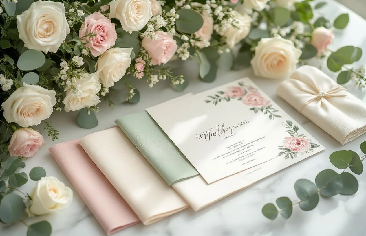
Flowers bring your color vision to life in the most natural way possible. Work with your florist to select blooms that match your primary palette while incorporating complementary shades for depth. White and cream flowers serve as perfect neutrals, allowing your accent colors to pop through ribbon choices, vase selections, and greenery.
Remember that flower availability varies by season, so remain flexible with specific varieties while staying committed to your color scheme. Peonies might not be available for your November wedding, but dahlias can provide similar soft pink tones. Consider the undertones of your chosen flowers - some whites lean warm while others appear cool, and these subtle differences can impact how they photograph alongside other elements.
Select linens, centerpieces, and reception decorations
Reception linens offer one of the biggest opportunities to showcase your wedding colors. Your tablecloth choice creates the canvas for everything else, so consider whether you want it to blend into the background or make a statement. Neutral linens allow colorful centerpieces and place settings to shine, while colored linens can anchor your entire tablescape design.
Centerpieces should complement rather than compete with your overall design. Mix heights and textures to create visual interest - tall arrangements draw the eye upward, while low designs encourage conversation across the table. Incorporate your wedding colors through candles, napkins, charger plates, and small decorative elements. Even subtle touches like colored water in clear vases can tie everything together beautifully.
Choose stationery and invitation colors that match
Your wedding stationery often provides guests with their first glimpse of your wedding aesthetic, making color coordination essential. Start with your save-the-dates and carry those colors through your invitations, programs, menus, and signage. Consistency across all printed materials creates a polished, professional appearance.
Consider the printing method when selecting colors. Digital printing allows for vibrant, exact color matches, while letterpress creates beautiful texture but may slightly alter color appearance. Foil stamping adds luxury but works best with metallic accents that complement your primary palette. Order paper samples before committing to ensure colors appear as expected, since screens and printers can display colors differently than reality.
Coordinate cake design and dessert table aesthetics
Your wedding cake and dessert table provide the perfect finale to your color coordination efforts. Work with your baker to incorporate your wedding colors through frosting, fondant details, fresh flowers, or decorative elements. Buttercream naturally lends itself to soft, romantic colors, while fondant allows for more vibrant, saturated hues.
The dessert table offers additional opportunities for color coordination beyond the cake itself. Use colored linens, coordinated serving pieces, and strategically placed flowers to tie the sweet treats into your overall design. Consider the natural colors of your chosen desserts - chocolate treats pair beautifully with gold accents, while berry tarts complement purple and pink palettes. Small details like colored paper goods, ribbons on favor boxes, or coordinated signage complete the cohesive look your guests will remember.
Balance Bold Colors with Neutral Tones
Bold colors can create stunning visual impact, but they need careful handling to avoid overwhelming your guests or creating chaotic decorations. The key lies in creating breathing space with neutral tones that let your vibrant choices shine without competing for attention.
When working with intense colors like emerald green, royal blue, or deep burgundy, pair them with whites, creams, beiges, or soft grays. This approach creates visual balance and prevents color fatigue among your guests. For example, if you've chosen a bold coral as your primary color, use it for accent pieces like napkins, bouquet ribbons, and centerpiece flowers, while keeping larger elements like linens and draping in neutral ivory or champagne.
The 60-30-10 rule works perfectly for weddings: use neutral tones for 60% of your color scheme (venue decorations, linens, larger floral arrangements), your main wedding color for 30% (bridesmaids' dresses, groomsmen accessories, some florals), and your boldest accent color for just 10% (bouquet details, place cards, small decorative elements).
Consider Your Skin Tones When Choosing Dress Colors
Your wedding photos will last forever, so choosing colors that complement both you and your wedding party creates the most flattering results. Different skin undertones work better with certain color families, and understanding this helps everyone look their absolute best.
For warm skin undertones (golden, yellow, or peachy), colors like coral, warm reds, oranges, golden yellows, and earthy greens create beautiful harmony. Cool skin undertones (pink, red, or blue) pair beautifully with jewel tones like sapphire blue, emerald green, deep purples, and true reds.
Don't forget about your partner's coloring too. If you have different undertones, look for colors that work well for both of you. Dusty blue, sage green, and deep burgundy tend to be universally flattering options that work across different skin tones.
When choosing bridesmaids' dress colors, consider offering multiple shades within your color palette so each person can select the most flattering option. This creates visual interest while ensuring everyone feels confident and beautiful.
Ensure Color Accessibility for Guests with Vision Differences
About 8% of men and 0.5% of women experience some form of color vision difference, making it important to consider how your color choices affect all guests' ability to navigate and enjoy your wedding.
Red-green color vision differences are most common, making it difficult to distinguish between these colors when used together. Avoid using red and green as your only way to convey important information. For example, if you're using colored escort cards to indicate meal choices, include text labels or symbols alongside the colors.
Create sufficient contrast between colors, especially for text and backgrounds on invitations, programs, and signage. Dark text on light backgrounds or light text on dark backgrounds works best. Avoid using color as the only way to communicate important information like seating arrangements or timing details.
Consider how your color choices will photograph and appear in different lighting conditions. Colors that look distinct in natural daylight might appear very similar under evening reception lighting, potentially causing confusion for guests trying to find their tables or follow your timeline.
Plan for Color Variations in Different Vendors' Interpretations
Color matching across multiple vendors presents one of the biggest challenges in wedding planning. Each vendor works with different materials, lighting conditions, and production processes, leading to variations even when everyone starts with the same color reference.
Create a master color palette with specific color codes (Pantone numbers, hex codes, or RGB values) rather than relying on names like "blush pink" or "sage green." Different vendors interpret these names differently, but standardized color codes provide consistent reference points. Share fabric swatches, paint samples, or printed color cards with each vendor whenever possible.
Schedule coordination meetings between key vendors, especially your florist, decorator, and stationer. Having them see each other's interpretations of your colors helps identify potential mismatches before your wedding day. Some colors translate differently across materials - a burgundy that looks perfect in silk might appear much darker in velvet or completely different in paper printing.
Build in flexibility by choosing a color palette rather than exact matches. Slight variations in shade can actually add depth and visual interest to your overall design. Focus on achieving the right mood and feeling rather than perfect color matching, and your guests will appreciate the cohesive beauty of your thoughtfully planned palette.
Your wedding colors set the entire mood for your special day, so getting them right matters more than you might think. Colors can make your guests feel romantic, energetic, or peaceful, and they should match the vibe you want to create. Start by figuring out your wedding style first – whether it's rustic, modern, or classic – then choose 2-3 main colors that work well together. Remember to think about how these colors will look across everything from your flowers and decorations to your bridesmaids' dresses and table settings.
Don't fall into the trap of picking too many colors or choosing shades that clash with your venue's existing decor. Test your color combinations in different lighting and consider the season when you're getting married. Your wedding colors should tell your love story and reflect who you are as a couple. Take your time with this decision, gather inspiration from various sources, and trust your instincts – after all, these colors will be in your wedding photos forever.
Still in search of the perfect wedding venue? Check out The Rustica at www.therustica.com. We would love to be part of your wedding day.